Clickbait in the Physical World: A Social Experiment
The Stata Center is the home of CSAIL, MIT’s Computer Science and Artificial Intelligence Laboratory. During the day, tons of students pass through the building on the way to classes and research labs. Among other things, the first floor of the building houses 7 giant blackboards that are often used by students to work out pset problems, to draw random math problems and puzzles for others to solve, and to advertise events to the MIT community.
Out of respect for each others’ puzzles and art, students do not erase anything that is written on the boards — it’s an unwritten rule of the Stata blackboards. Once something is up there, it’s there for the rest of the day. The janitors seem to erase the boards around 3 or 4am.
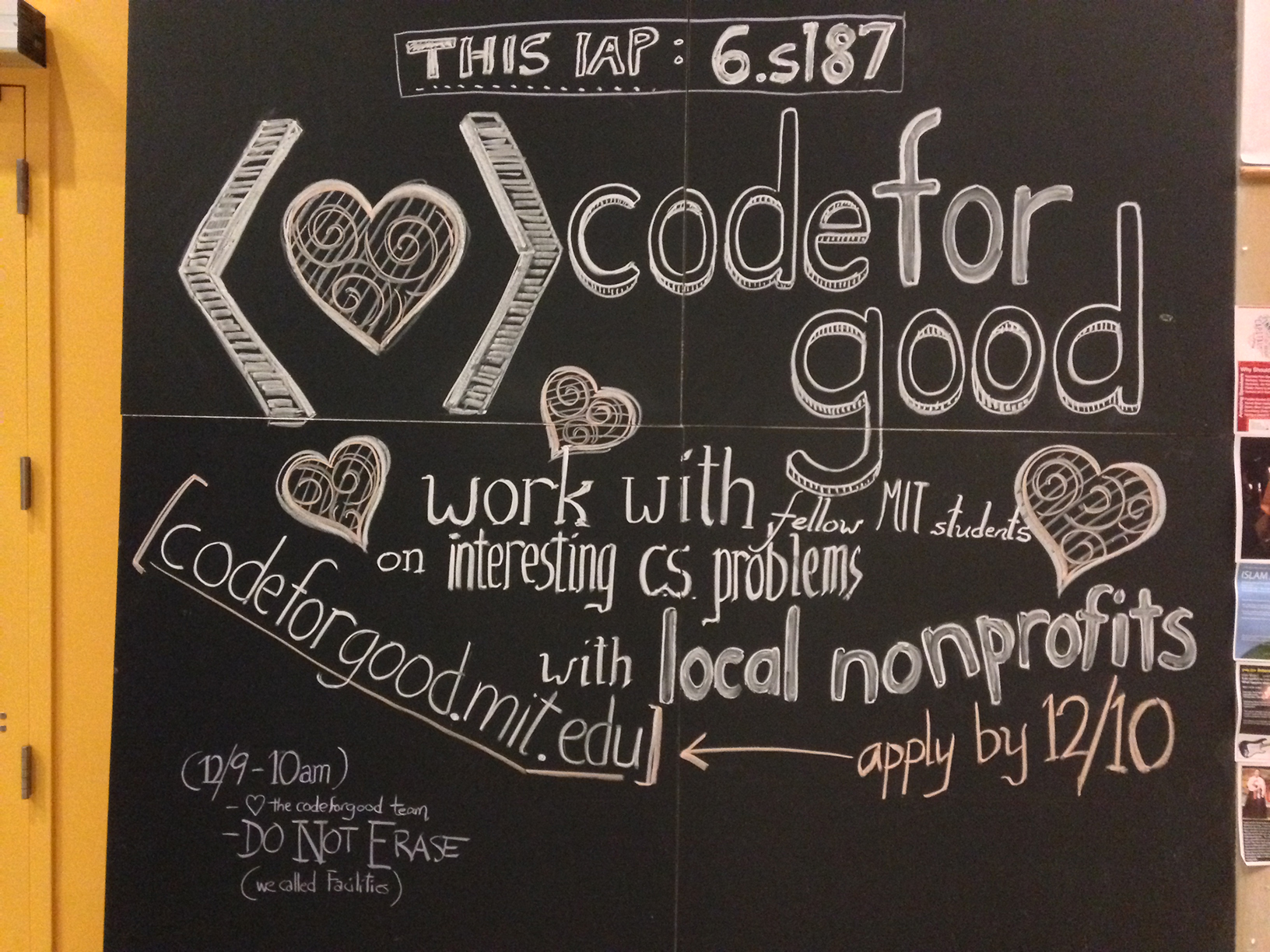
Because so many students visit Stata during the day, it’s a great place for advertising events, especially when targeting the CS community. Many organizations that I’m a part of, including HackMIT, Blueprint, and Code for Good, have chalked the Stata boards. I’m not that great at artwork, so most of the time, I sit back and watch my more artistic friends draw beautiful art, such as the 10-foot-tall chalk art that Ben drew for Code for Good:


Great chalk art can easily take a couple hours (per board) to draw. It’s usually infeasible to draw great art on all the boards in Stata, so I thought it would be awesome to understand which boards receive the greatest engagement in order to better focus efforts. Plus, it would be pretty cool just to see how people interact with the boards.
The Experiment
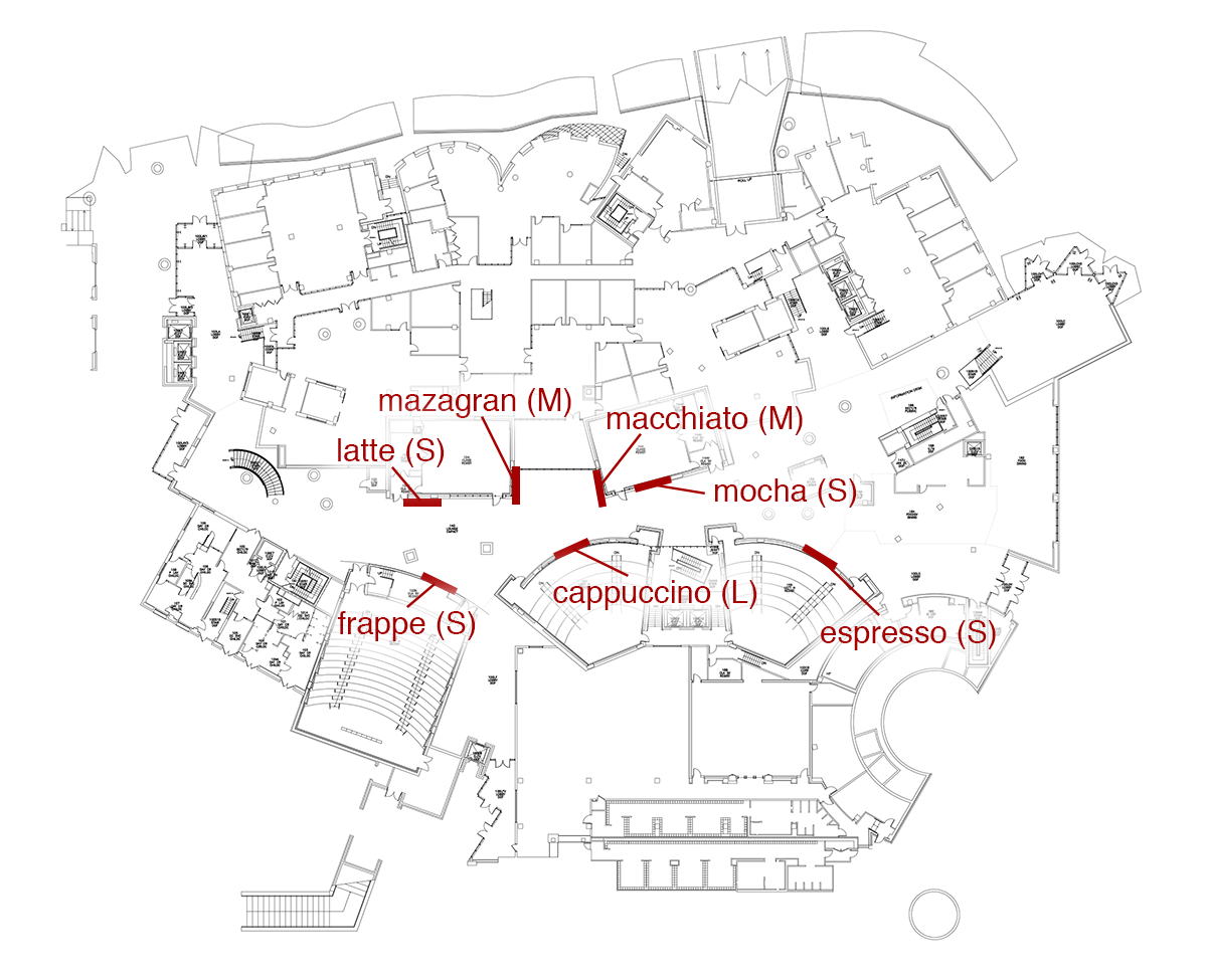
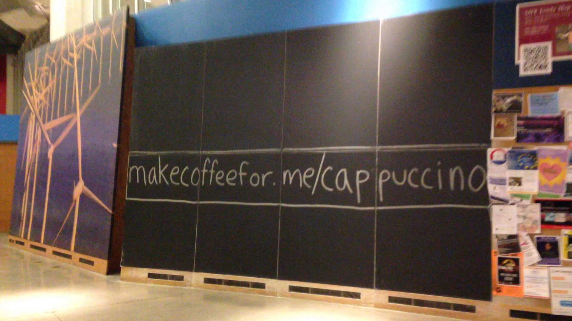
On Friday (2/13), I ran a simple social experiment to see how people interact with the Stata blackboards. I woke up at 3:45am and headed over to Stata to draw on the freshly erased boards. On each of the 7 blackboards, I wrote a unique URL: makecoffeefor.me/{cappuccino, espresso, frappe, latte, macchiato, mazagran, mocha}. The boards varied in size, so I tried to write the longer URLs on the larger boards.
The URLs were written so that they were large enough to see from a distance:
The site was essentially a simple puzzle that displayed how many URLs had been visited (e.g. “3/7”) and ASCII art that changed as a function of the number of correct URLs visited:

I didn’t really have any concrete hypotheses about the experiment — I just wanted to see what would happen.
Data
I logged every visit, keeping track of the access time, IP address / session ID, URL, and a list of collected coffee types. All the data used in the following analyses is publicly available in anonymized form as tab-separated values. If you do any interesting analyses with the data, please let me know!
Analysis and Observations
This is not a thorough statistical analysis of the data. It’s mostly observations of things that I thought were interesting or fun to think about.
A Puzzle?
From the data (and from hearing from my friends after the fact), a lot of people seemed to think that this was a puzzle where the objective was to guess the types of coffee rather than find all the URLs written on the boards. Here is a word cloud made up of the different words that people guessed:
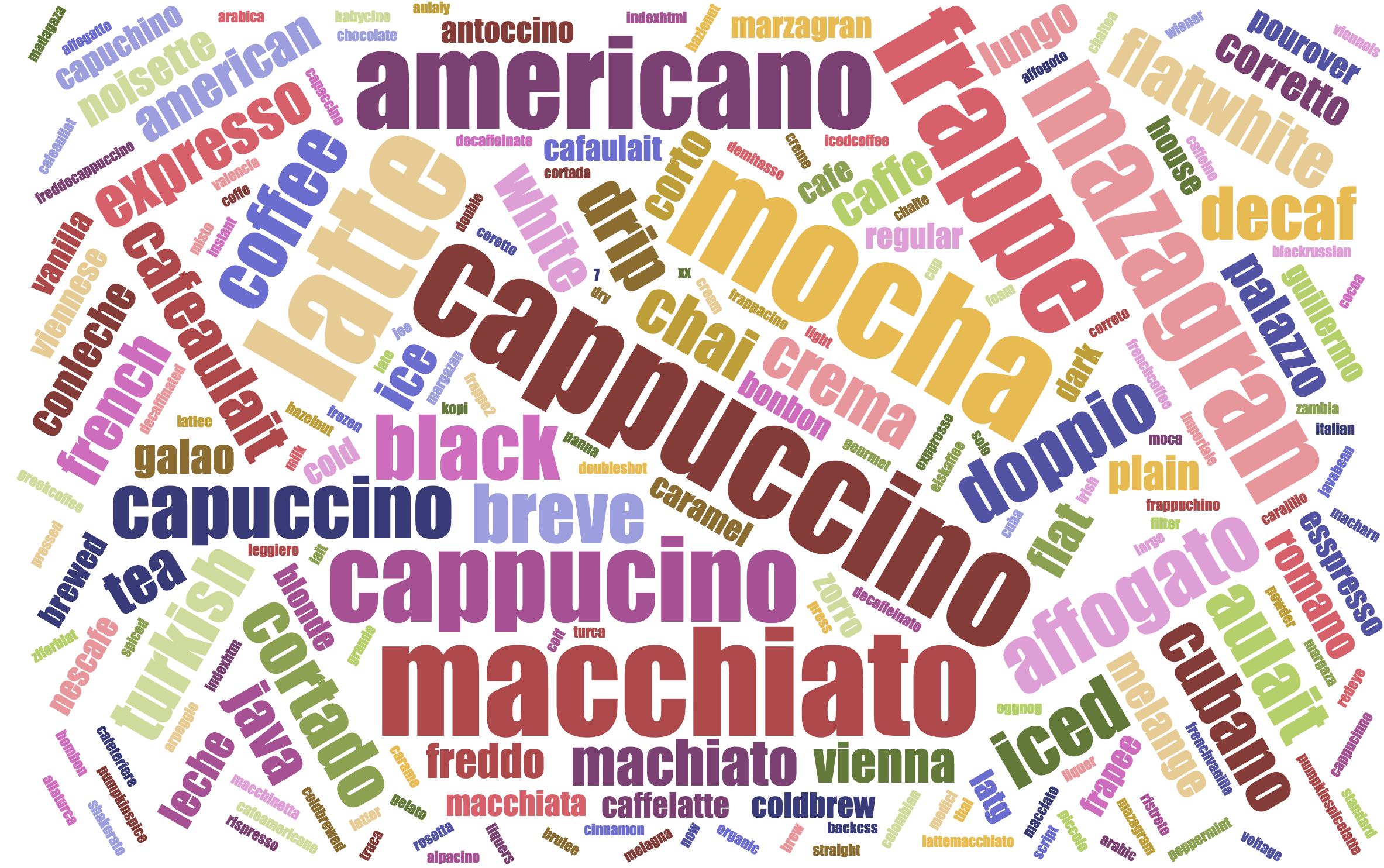
Six of the seven types of coffee were reasonably easily guessable, while “mazagran” turned out to be one that’s quite difficult to guess. It’s interesting to look at incorrect names that people tried — there were 235 unique ones. Some were not among the seven coffees recognized by the system, and others were misspellings. Here are the five most popular ones:
40 americano 32 cappucino 12 affogato 12 black 11 capuccino
It’s interesting to note that two of them, “cappucino” and “capuccino”, are misspellings of “cappuccino”. Of the 31 unique individuals who misspelled cappuccino, 16 of them got it right eventually.
Access Patterns
We can also look at the times website accesses occurred:
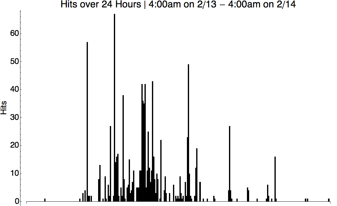
The class schedule helps explain the spikes and gaps to some degree.
Maximum Engagement
Among other things, I wanted to learn which board receives the most engagement. One way to reason about this is to consider each board and count how many first-time visits it received:
44 mocha 27 latte 21 espresso 17 cappuccino 13 macchiato 9 frappe 5 mazagran
Another similar metric is the total number of visits per board:
123 mocha 117 latte 106 cappuccino 88 macchiato 82 espresso 63 frappe 46 mazagran
The order is similar, and it seems that “mocha” is the most visited board! This data indicates that it would be a good idea to focus on that one when making chalk art. Incidentally, “mocha” is the board we used for the Code for Good drawing pictured above.
Individual Behaviors
It looks like some people who seem to have interpreted this experiment as a puzzle took the puzzle quite seriously, spending a fair amount of effort trying to guess the seven types of coffee. The user with the greatest number of page views had a whopping 154 page loads, which is 130% more than the next highest ranked user. Looking at the behavior patterns, this person seems to have spent roughly one hour and thirty five minutes trying to guess the seven types of coffee. Unfortunately, even after 105 unique guesses, the person didn’t manage to guess the last one, mazagran.
On the other end of the spectrum, there were 69 individuals who only loaded a single page and then never revisited the site.
Reflection
Never having done anything like this before, this experiment was a pretty fun experience. The data was interesting to go through, especially looking at individuals behaviors and reactions to the experiment.
I didn’t tell most of my friends about the experiment until after I was done collecting data, so I was able to see their reactions to what was going on. It seems that most people did interpret the experiment as a puzzle, and even though it was a pretty simple puzzle, they got pretty excited about solving it. This wasn’t what I had expected, but it was a pleasant surprise to see so many people curious about what was going on.
Your Turn
What is presented above is by no means a complete or rigorous analysis — it’s more like an exploration of some of the data.
As I described earlier, all the data used in the analysis is publicly available in anonymized form. It would be awesome to see people take this data and find new insights. If you do happen to do anything with the data, I’d love to hear about it!