Evolution Chamber
A couple weeks ago, HackMIT ran an experiment to see what would happen if we evolved a HackMIT logo based on the Internet’s preferences. Before getting into the details of how we did it, here’s the final result:
The Internet ended up choosing that logo out of possible designs after casting over 200,000 votes! The logo will be printed as a sticker for participants at HackMIT 2015. Here’s the story of how the design came to be.
Algorithm
First, we wrote code to procedurally generate a HackMIT logo based on a whole bunch of parameters that controlled the color palette, the opacity, and the way shapes are positioned and overlaid. In total, there are about ways to set these parameters. With the parameters chosen randomly, we could have a logo that looks like this:
It’s not very pretty! To fix it, we needed a way of choosing a good set of parameters. Unfortunately, we couldn’t just try every possibility and pick the best one — there would be way too many logos to choose from. We thought about phrasing the problem as a combinatorial optimization problem, but that wouldn’t work either. A computer algorithm can’t pick the best looking logo because a computer can’t decide how good a logo looks — we can’t program that behavior!
Needing a better approach to the problem, we looked into taking classical artificial intelligence techniques and adapting them to have a human component. We ended up using techniques from genetic algorithms and modifying them to fit our needs.
Genetic Algorithms
Here’s a brief introduction to genetic algorithms. GAs find solutions to optimization problems by emulating the way evolution works in nature. Candidate solutions to a problem can be thought of as individuals in a population. To begin with, an initial population is initialized with random parameters. Candidates are assigned fitness scores based on the quality of the solution, and the most fit subset of the population is used to breed a new generation, mimicking the process of natural selection. Solutions are combined through crossover and mutation, where characteristics of solutions are combined and subjected to random variation. The hope is to arrive at higher-quality solutions by combining fit parents. Repeating this process over many generations can yield high-quality solutions to optimization problems.
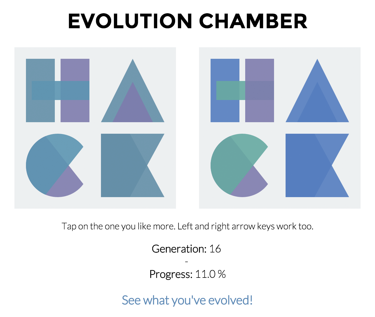
There’s just one problem with using a genetic algorithm for our application — in traditional GAs, the process of assigning fitness scores is completely automated. In our case, we require human input to compare logos. To incorporate human feedback, we built a website where people could vote on logos through side-by-side comparison of two logos at a time. We used the Elo rating system to compute actual fitness scores based on comparisons.
Evolution
After developing the code, we put it online at evolution.hackmit.org and publicized it everywhere we could — Facebook, Twitter, Hacker News… We wanted as much data as possible. Here’s how the website looked a couple minutes after we launched it:
We were on the front page of Hacker News for a couple hours, which in combination with our posting on Twitter and Facebook, led to us getting a lot of data. Running the experiment over about 10 days, we received 220,200 votes and evolved 2202 generations of logos.
Here’s an animation of the evolution over the first 100 generations. You can see that it converges quite quickly:
Discussion
There were several limitations in our approach. We combined genetic algorithms with human input in an ad-hoc way without developing any rigorous mathematical theory to understand and validate the behavior of our algorithm. Considering that this project was developed in the span of about 12 hours, that wasn’t really possible.
Besides that, there were a couple other things. While we were collecting votes, there were a ton of different people providing input. It is likely that there were people who had different opinions about which logos looked good, which would influence rankings and prevent convergence. One thing we could have tried to improve on is variation in logos. Differences in color palette were the most apparent; differences in other parameters such as opacity and arrangement arguably didn’t impact the design as much. However, adding more variation is a tricky problem when we want to ensure that we keep logos similar enough to the HackMIT logo to be recognizable.
At the end of the day, it’s important to keep in mind that what we did is not academic work — it’s a fun social experiment. It was a cool idea to try out, and it was great that we ended up getting input from a whole bunch of people and arrived at a result that looks visually appealing.
Source Code and Data
The full source code for this experiment is available here. The data we collected from over 200,000 votes on evolution.hackmit.org is available here.
If you do something cool with the data, I’d love to hear about it!