FAQ Readers Redux
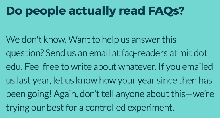
Another year, another HackMIT FAQ readers experiment. From May 31 to August 7, we had the following item in HackMIT’s FAQ:
Like last year, the experiment wasn’t particularly scientific. We just wanted to give people the opportunity to email us random stuff.
Last year, we did a qualitative analysis of the emails we received, so for a change, this year, we took a very quantitative approach.
Basics
We had 227 unique individuals email us (compared to 493 last year). We responded to 220 of these people, giving us a response rate of 97% (up from 80% last year).
The distribution of response times was pretty good:
A handful of team members were responsible for the majority of responses:
Some team members got pretty competitive trying to be the fastest to respond to emails:
Time
Even though the experiment began on May 31, we received a lot more email once registration opened on July 1st, receiving the greatest number of emails on July 2nd:
People did sent us email at all hours, but the morning seemed to be the least popular time to send messages:
Domains
Unsurprisingly, gmail.com and mit.edu were the most popular email domains
among FAQ readers:
Text
Emoji
Emoji were quite popular in our emails. Among all the emails that were sent and received, here are the most used emoji:
Apparently, the HackMIT team really loves emoji, being responsible for 67% of the total emoji use:
Sentiment
Luckily, the majority of emails we received were positive (according to a sentiment analysis engine):
Here’s the most negative email we received:
And here’s the most positive:
Conclusion
Okay, so most of this data analysis is pretty silly. It’s not meant to be taken too seriously! We had a great time going overboard and making pretty graphs.
In case anyone is curious about how we did the analysis, here’s a short
summary. We archived all the emails that were sent to [email protected],
and after the conclusion of the experiment, we loaded all the data into
a Jupyter notebook using Python’s mailbox library. We
analyzed the data using NumPy, pandas, NLTK,
TextBlob, talon, and emoji, and we made the
graphs using matplotlib and Seaborn.
Thanks to Claire, Kimberli, Stef, and the rest of the HackMIT team for feedback on this post!
